| Etsy Buy Handmade fhfteam |
Wednesday 18 August 2010
Thursday 1 April 2010
Reichenbach Multicolour Experiments
Ok, so it turns out that which batch of multicolour you buy makes a HUGE difference to the working characteristics of this truly fabulous glass by reichenbach.


Myself and some other people on Frit Happens forum discovered this glass a little while ago and bought the EU multicolour mountain from Sean at Off-mandrel and for a while all was hunkydory. I fell in love and m
ade this goddess available in my Etsy shop.

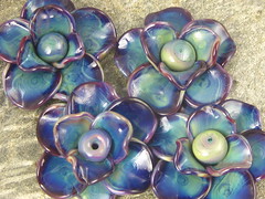
However, all was not well. After a while Tuffnell Glass posted that they had some now in stock, so everyone rushed to buy; including Sabine of Little Castle Designs who makes the most fabulous rose ring toppers from the original batch.

After a while everyone realised that the second batch was much more awkward than the first, and because of the way the roses are made, Sabine couldn't get the fab colours out.
So I went over to hers with what was left of my original batch on saturday and had a play with the second batch to see if I could get anything out of it.
Here is the result.
Overall I discovered that you have to heat it and get into shape and keep hot until you're ready to strike the colour. It goes green transparent whilst hot. If you overstrike it the only solution is to heat back to gloopy. Once ready for colour, you let it cool down as much as possible and then gently reheat until the desired colour appears.
The colours go from dark purple -> dark blue -> light blue -> greens -> green snot
In Sabines kiln as well, it kiln struck slightly, so most colours have changed from how I put them in.
Going from top left, clockwise. The first lentil was heated, pressed while glowing, had the chill marks taken off and then allowed to cool down before being flashed in and out of a neutral flame to strike.
The encased one was dark purple before encasing, but struck greener whilst encasing with the heat from the clear. I discovered that you could reset the colour by making it gloopy, but this wasn't possible whilst encasing.
The spacers I made all on one mandrel, and they went transparent whilst forming and then after I'd made them I slowly moved the mandrel back the other way and they went purple. I put them in the kiln purple, but as you can see, they went more blue.
The undefined crystal shape was the one I made first and I'd got fed up with heating and pressing and striking, and I was reheating it again, ready to re-strike and got fed up and stuck it in the kiln. Interesting selection of colours though. It wasn't like that when it went in!
The big purple crystal shape, I pressed whilst fairly runny and reheated the outside to polish whilst still glowing in the centre. I let it cool down then stuck it in the kiln and it struck to this fab purple colour!
The two hearts, the top one I struck too hot, so it went this funny snot colour. The second I got better colours on but it changed in the kiln.
I hope you find this helpful, and feel free to email me with any questions at joannabailey AT me.com
Here is the related Multicolour post on Frit Happens.
Thursday 4 February 2010
Josephine Wadman
One of the forums I belong to is having spotlights on its professional members, and the current one is Josephine Wadman. I decided to write a long post about her as she is one of my regular suppliers. She makes fantastic beads!

Just look at this amazing winter tree! She also makes fantastic sets of beads, some of which I have made up into bracelets, like this one!

I'd love it if you wanted to commission me to make something with any of her beads.
Visit her site here: www.josephinewadmandesigns.com
Friday 29 January 2010
Can Art Save us?

I find inspiration interesting. For example, I went to an exhibition today at Museum:Sheffield Millenium Galleries entited 'Can Art Save Us?' For some reason, I was expecting it to answer this question. (silly me!)
It is an exhibition based on the collection of John Ruskin, but the works weren't limited to his collection only. There were also modern and associated pieces based on the principles by which he built his collection.
It's interesting to me that whilst I saw many fascinating pieces there, including a fantastic 10th century illustrated manuscript, the piece that I found the most inspiring is this very simple study of a peacock breast feather. I was always aware that I like simple things, but I also live looking at fantastic and detailed things by other people, yet my overall impression of the exhibition is centred on this small drawing.
All I have to do now is work out how to interpret this into my own work!
All I have to do now is work out how to interpret this into my own work!
Subscribe to:
Posts (Atom)


